Sunday, 13 March 2016

Hair Technical File- Adding accessories to a Chignon


Firstly we were shows different photos of Chignons and what they look like and how you can style it. Lottie then gave us a demonstration on a Kate head of how to create it then allowing us to create our own version and style it how we want to and finally adding an accessory to the hair.


Equipment:

  • Paddle brush
  • Pin tail comb
  • Clips 
  • Handband 
  • grips 
  • hair spray 
  • accessories 

  1. Firstly I started with sectioning the hair so I knew what goes where. I firstly created a side parting with my pintail comb, and used a clip to keep them neatly aside. I then parted the fringe off from the back using the ear as a guideline of where to part on both sides of the head. 
  2. I then got a hairband and used the brush to neatly put the hair in a mid pony tail. Once it was up in a pony tail I used my comb to back comb the pony tail to give it some volume. I then brushed over the top of the pony tail slightly to neaten it and I used my pin tail comb to fold the pony tail over and grip in to the head. I used a few grips to make sure it was nice and secure to the head. 
  3. I then used my pin tail comb to spread out the bun to either side of the head. finally I used small thin grips to discreetly place them in the hair to secure each side of the chingnon. 
  4. Next was the front of the hair, I took the left side out of the clip and started at the top of the section and started french plaiting down until the ear and finishing it off with plaiting until the end. I then took the plait and brought it round over the chignon and tucked the end into the hair and gripped it down. 
  5. Finally was the other side of the hair to plait, which I took out the clip and started at the top of the hair and plaited down to the ear and carried on until the end of the hair. I then brought the hair over the chignon and tucked in the ends and gripped it in place so the ends are hidden. 


    Finally I added a large flower to the center of the hair, it was on a silver chain so I had to tuck the chain in the center under the plait for it to stay in place and hang in the center. 


    Final evaluation

    Overall I was very pleased with the outcome of creating my first chignon. I think it was a very good size and shape, I think the hardest part was separating the chignon and gripping the sides down while making sure it was neat and didn't have large gaps in the hair. I used my comb to spread the hair out and evenly place it so I could grip it to the side of the hair. After creating the whole design and the plaits I realised the plait on the left side was a french plait and the one on the right side was dutch so they were slightly different on either side. When plaiting the hair I need to make sure I'm paying attention to what my hands are doing and the plait I am creating. Overall I think it came over very need and I was happy with the outcome for my first try. 

    Health and Safety:
    • don't run in the studio
    • keep works station neat and tidy 
    • keep bags and coats away
    • be careful of any trailing cable or hot equipment 


    Friday, 11 March 2016

    Top 10 Campaigns of the Season

    http://www.businessoffashion.com/articles/opinion/top-10-campaigns-spring-summer-2016


    The innovative fashion advertising remains rare and brands are creating bold seasons to attract the consumers, this season are a hard competition and brands sought to cut through the noise and differentiate themselves this year. 


    1. Marc Jacobs — Starring Lana Wachowski, Sandra Bernhard, Bette Midler, Kiki Willems, Veronika Vilim, Dan Donigan, Joan Smalls, Adriana Lima, the Cleveland family, Emmanuelle Seigner Morgane Polanski, Oli Burgslem Lili Sumner, Vinny Michaud, Tracy Antonopoulos, Mari Agory and Sam York by David Sims


    Marc Jacobs Spring/Summer 2016 Campaign | Source: Courtesy

    Marc Jacobs broke new ground by taking a campaign and turning it into online content with the engagement factor of editorial. He posted the shots on instagram which has a audience of 4.3 million, while he had a handpicked mix of celebrities and models that have inspired him and opened his mind over a 30 year long career. He described the overarching narrative of the campaign as “My America”, which provides viewers into the designers artistic development. The campaign features a range of age groups, genders and backgrounds, and a couple of supermodels in Adriana Lima and Joan Smalls. Shot by his long-term collaborator David Sims and styled by Katie Grand, the campaign stands out from the crowd for its story-telling, not just in magazines and on billboards, but crucially, on the all-important social media channels.


    2. Valentino
    — Starring Alice Metza, Cameron Traiber, Greta Varlese, Kirin Dejonckheere and Tami Williams by Steve McCurry


    Valentino Spring/Summer 2016 Campaign | Source: Courtesy


    The East African savanna forms the backdrop for Valentino’s latest collection. Creative directors Pierpaolo Piccioli and Maria Grazia Chiuri asked National Geographic legend Steve McCurry — known for his world-famous portrait “The Afghan Girl” — to turn his lens on Kenya’s Amboseli National Park as models wearing tribal inflected ready-to-wear posed under acacias and stood sentinel among leaping Masai tribespeople. The collection had caught some attention in October when the designers where accused of cultural appropriation as they mainly used white models. However this reminds us of the long-standing dialogue between fashion and the continent, which goes back as far as Saint Laurent’s animal prints in the 1960s, Iman’s arrival on the catwalk in the 1980s and Demi Moore standing next to a giraffe on the cover of the April 2010 issue of US Harper’s Bazaar.


    3. Balmain — Starring Claudia Schiffer, Cindy Crawford and Naomi Campbell by Steven Klein


    Balmain Spring/Summer 2016 Campaign | Source: Courtesy

    Creative director Olivier Rousteing has bolstered the ranks of his Balmain army, recruiting three original supers. Claudia, Cindy and Naomi are captured in monochrome by Steven Klein with creative direction from Pascal Dangin. Rousteing released the images through his Instagram consisting of 2.2 million followers with the hashtag #thisisHISTORY, making a point that the campaign would be the first chapter in the brands’ efforts to go back to its roots.


    4. Gucci — Starring Polina Oganicheva, Peyton Knight, Elizabeth Moore, Nicole Atieno, Mia Gruenwald, Anka Kurydina, Viola Podkopaeva, Jacob Hugo Goldhoorn, Timothy Dibble, Arnis Cievala and Anton Tofgart by Glen Luchford


    Gucci Spring/Summer 2016 Campaign | Source: Courtesy

    Creative director Alessandro Michele’s faces the pressure to build on the momentum he gained by reviving the brand last year. Shot once again by Glen Luchford, the most alluring scene from the series is a party on a Berlin rooftop, suffused in langour and glamour. As the sun sets and the eccentric characters sashay about, the spectator is sucked into a 1970s fantasy world. Elsewhere in the campaign, night owls take the subway and hang out in club toilets; one even goes skateboarding with a peacock under her arm. Sumptuous, surreal and effortlessly cool, it’s another winner from the Italian house whose star is very much in the ascendant.


    5. Raf Simons
    — Starring Luca Lemaire by Willy Vanderperre


    Raf Simons Spring/Summer 2016 Campaign | Source: Courtesy

    For Raf Simons’ first print advertisement for his own label since stepping down from Dior, the designer called on fellow Belgians, the photographer Willy Vanderperre and stylist Olivier Rizzo. The three of them have created a series of coloured and black and white disturbing images of a relationship between a man and a hooded figure. Simons had explained at a show he never know his grandfathers and got to know them through photographs in which they would always wear the same clothes. With an anonymous faceless friends, Simons subtly shows the absence of his grandfather through photographs as the campaign represents his attempt to blend the past and present.


    6. Louis Vuitton
    — Starring Lightening by Tetsuya Nomura with visual works by Square Enix


    Louis Vuitton Spring/Summer 2016 Campaign | Source: Courtesy
    Louis Vuitton has taken the bold step of casting a CGI heroine in its latest campaign. By including the character Lightening from Final Fantasy XIII, the French brand takes on the virtual world of anime and draws the pink-haired model holding up a Petit-Malle bag. The brand worked in collaboration with character designer Tetsuya Nomura and Japanese video game developer Square Enix on the campaign, which also features Jaden Smith among other Vuitton vixens, shot by Bruce Weber.


    7. J.W. Anderson — Starring Mayka Merino by Jamie Hawkesworth


    J.W. Anderson Spring/Summer 2016 Campaign | Source: Courtesy

    JW Anderson bravely uses a postage stamp to sell his name as you can't expect J.W Anderson to play by the rules. This year he had already made a name for himself as on of fashions foremost innovators by live streaming a menswear collection on gay dating app Grindr. In this image featuring Spanish model May Merino, the British designer gives a masterclass in 'less is more'. By turning a head shot if Keith Haring-inspired collection into a postage stamp, throwing out all conventional wisdom.


    8. Equipment — Starring Kate Moss and Daria Werbowy by Daria Werbowy


    Equipment Spring/Summer 2016 Campaign | Source: Courtesy

    Equipments Spring/Summer campaign featured Daria Werbowy and Kate Moss looking into a mirror. The pair embark on a fictional desert island romance, which makes a strong advertising mix. Both models flew to the West Indies were the campaign was photographed by Werbowy herself, a photographer who spends most of her times in Ireland away from the fashion world. Wearing nothing more than this seasons menswear-inspired shirts, the campaign is a celebration of the modern relationship between two women. 


    9. Céline
    —
    Starring Vera van Erp, Regitze Christensen and Karly Loyce by Juergen Teller


    Céline Spring/Summer 2016 Campaign | Source: Courtesy

    Starring new faces Vera van Erp and Regitze Christensen along with last season Karly Loyce, creative director Phoebe Philo called on Juergen Teller for the lastest Céline campaign. The models were cut out and set against coloured backdrops creating a scrap-book like collage. Following on from Spring/Summer 2016 collection when Philo was inspired by everything the Céline woman might need for a year-long trip, the campaign underscores the evolution of who that woman is. After that show, Philo said she imagined the Céline woman leaving the city, putting her feet in the sand, being in nature. The confident, unselfconscious women of this campaign, clothed in softer, freer lines than the stark minimalism once synonymous with Céline, appear ready to do just that.


    10. Dior Homme — Starring Oliver Sim, Alain-Fabien Delon, Rinus Van de Velde and Victor Nylander by Willy Vanderperre


    Dior Homme Spring/Summer 2016 | Source: InDigital.tv

    For Dior latest campaign the creative director Kris Van Assche sought to embody todays nuanced Diors Homme spirit by casting a range of young creatives across the industry. The xx’s bass player and vocalist Oliver Sim is joined by artist Rinus Van de Velde, model Victor Nylander and actor (and son of French heart-throb Alain Delon), Alain-Fabien Delon Jr. Shot by Willy Vanderperre, the featured creatives wear dark modern suits from the Spring/Summer 2016 collection, cut with typically sharp lines and decorated with zips. The alongside film titled "Stranger in a Room" shows intimate moments in the artists' creative processes, Sim scribbling down lyrics to a song, Van de Velde sculpting, with Sim's band-mate Jamie xx providing the soundtrack.

    Tuesday, 8 March 2016

    Advertising Chanel

    In our recent lecture with Kat we were looking at the Advertisement of Chanel and between the fashion film created for Chanel N05 and its advertising campaign to go with the short film which stars Gisele Bundchen the Brazilian model. 

    https://www.youtube.com/watch?v=8asRWe5XNw8

    Chanel No. 5 was the first perfume launched by French designer Coco Chanel, and it is considered one of the most iconic and seductive fragrances of all time. In the 1950s, the scent became synonymous with glamour when the movie star Marilyn Monroe, asked in a 1954 interview what she wore to bed, provocatively responded: “five drops of Chanel No. 5.” In 2014 Gisele was chosen to be the new face of Chanel and is following the footsteps of Nicole Kidman, Brad Pitt and Marilyn Monroe, it was to be said she was chosen for her “natural beauty and modern femininity,” according to the company. Chanel mixes up its audience with using different faces for the Brand, in this 3 minute film starting Gisele for Chanel N05 she provides evidence that the Chanel women can be young and beautiful, have a successful job, family women having a husband and child while also being free and sporty. Chanel portrays many trades the Chanel women can be while Gisele was chosen for natural beauty and femininity. While Chanel creates this beauitful film of which represents a love story, the trate of the N05 appears throughout the film appearing in places you don't even notice as some as sutble hints to Chanel N05 as its on the surf board, earrings, car keys, bridge, necklace, sea etc.

    CHANEL N05
    http://media4.popsugar-assets.com/files/2015/08/19/036/n
    /4852708/dba73dfaf9c0fc81_GISELE-BUNDCHEN-Chanel
    -No.-5-Promos-1j4BJQH.xxxlarge/i/2014.jpg


    https://media.licdn.com/mpr/mpr/shrinknp_800_800/p/6/005/0a1/1bf/209b35b.jpg


    LES BEIGES COLLECTION 

    http://www.fashiongonerogue.com/wp-content/uploads/2014/0
    5/gisele-chanel-les-beiges-makeup-ads-photos1.jpg

    http://profashioneye.com/wp-content/uploads/2015/0
    6/Chanel-Beauty-2015-Gisele-Bundchen-791x1024.jpg

    Gisele then went on to be the face of the LES BEIGES make-up line where where she did multiple advertisements for the collection including the top photo which the advertisement linked into the short film created. Les Beiges is all nudes and neutral colours and adds a range of coloured lipsticks etc. The launching date was March 2015 and the campaign was shot by Mario Testino and introduces Chanel's new mattifying compact powder. The Les Beige collection is constantly being added to and the advertisements are based around the colour beige which is a theme throughout the ads including the backgrounds, garments, make-up etc. is all based on the colour. The advertisement for the make-up is very natural and flawless and really projects the colour well. When thinking of creating advertisements the make-up and setting really has to project the collection, its meaning and colours within the image. This collection is all round for anyone and because its neutral it can fit a broad audience the only thing stopping you would be the price. 

    CHANEL AD
    Below are a few photos by Chanel for advertisements for there Spring/Summer make-up collection

    http://www.fashiongonerogue.com/wp-content/uploads/2015/01/chanel-
    spring-2015-beauty-makeup.jpg
    http://mosnarcommunications.com/wp-content/uploads/2014/01/
    Chanel-Spring-Summer-2014.jpeg

    http://www.atouchofblusher.com/wp-content/uploads/2013/06/
    Chanel-Summer-2013-Makeup-Top-10-1.jpg


    CHANEL S/S EDITORIAL
    Below are a few different photos by Chanel of different years of S/S editorial looks. 

    https://trendsandtribulations.files.wordpress.com/2012/10/chanel2.jpg

    http://images.thesartorialist.com/thumbnails/2014/03/chanel2724web.jpg

    https://s-media-cache-ak0.pinimg.com/236x/85/b2/7e/85b27e138d1c5e801979e5af452fdee0.jpg
    https://s-media-cache-ak0.pinimg.com/736x/aa/b8/b9/
    aab8b986563aa53538eb73c561cb50cc.jpg


    http://www.vogue.co.uk/beauty/2013/02/gisele-bundchens-les-beiges-chanel-campaign
    http://time.com/118622/gisele-bundchen-chanel-no-5/
    http://wwd.com/fashion-news/fashion-scoops/baz-and-gisele-take-five-7692136/

    Hair Technical File- modern interpretations of 50’s, 60’s and 70’s

                         1960's 
    Equipment:

    • paddle brush 
    • pintail comb
    • heated rollers
    • clips
    • hairspray
    • grips
    Firstly Lottie gave us a demonstration of different styles and what we can create with the choice of the different decades. After looking at images online I decided to go with the 1960's and create a bouffant style with a quiff giving the hair a lot of volume. 

    1. I started with getting the rollers out and plugging them in and getting them heated up ready to use. Once they were hot I brushed through the hair and sectioned the top part ready for the rollers. Since I was creating a quiff at the front I needed the direction of the rollers all going backwards in the direction that I want the hair. 
    2. I used the red rollers for the top section as they are the largest ones to create volume for the particular style I want. I then put three red rollers face backwards down the center of the head and clipped them in place. 
    3. I then started on the side section of the head where I used blue rollers which are slightly smaller at the front of the head all facing backwards creating brickwork pattern. 
    4. At the back of head where the crown is this is where I want the most volume so I used red rollers at the back and the sides of the head. 
    5. When I got to the last part at the bottom of the head I went back to blue rollers to give a tighter curl at the bottom. I placed the rollers all in the direction I wanted the hair to go and used the size according to the lift and curl size. As I didn't want curls I wanted more volume and body throughout the hair I used the largest rollers. 
    6. I then waited for the hair to cool down and finally started taking all the rollers out of the hair. 
    7. Once all the rollers where out I brushed through the hair once and then used my comb to started back combing from the top to the back giving the hair more volume. 
    8. I then section the front off with my pintail comb for the quiff, once I had a section large enough I back combed the section of hair and then placed it where I wanted it and gripped it down. I then went back to the top of the hair where  want the most volume and back combed the crown section.
    9. Finally I went all over with the hair spray to set the look and quiff. 


    Evaluation 

    Over all I think the style came out very well with the volume I needed throughout the hair. I was pleased with the outcome of the rollers as it gave the hair the direction and lift I needed to execute the look. If I could do it again I would try it on a real head instead of the Kate head to see if the style looks any different, I also would of preferred if the hair was a little bit longer because its quite short so does effect the look overall. As when giving the hair volume and lift the hair shortens anyway so I would of preferred longer hair. The rollers gave me the wave I needed as I didn't want the hair curly it was more about the volume. I think I still need more improvement with rollers which will come with more practice when creating styles because I need to get the hang of putting them in securely clipped without any drag. 

    | FINAL LOOK |


    Health and Safety:
    • Do not run in the studio
    • Be careful with hot equipment such as heated rollers
    • Be careful with trailing wires
    • Keep bags and coats away from work area
    • keep work area neat ad tidy


    Monday, 7 March 2016

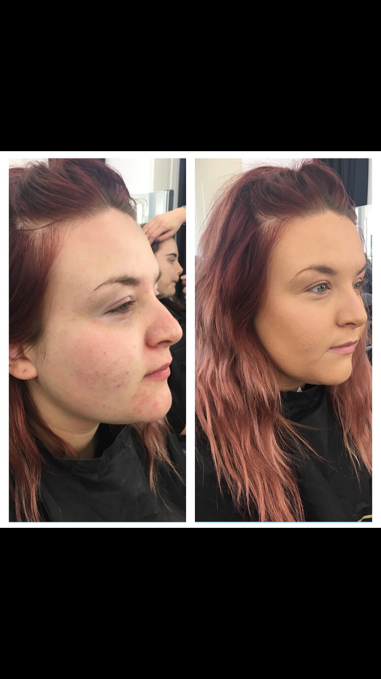
    Make-up Technical File- Catwalk contour: highlighting, contouring and blushers

    Contouring


    Products:
    • simple face moisturiser 
    • Laura Mercier Primer
    • Collection Illuminating touch brightening concealer
    • Nars concealer vanilla 
    • maybelline dream satin liquid 60. caramel
    • Ben Nye banana powder 
    • Illamasqua duo sculpting powder and highlighter
    • MAC highlighting pink nude powder 
    • Estee Lauder bronze goddess medium
    First step was making sure the face is nice and clean and hydrated ready for the application of make-up.

    1. Firstly I applied primer all over the face, I then used brightening concealer under the eyes and on the lids.
    2. Next was concealing certain areas, I used it under the eye again, middle of the forehead, under the cheekbones, centre of nose and on the chin. I then used a dark foundation called dream satin liquid and contoured certain areas which were top of the forehead and sides, cheekbones, jaw line and chin and nose. Using my Real Technique blending brush I blending it all into the face working in circular motions and also down the neck. 
    3. I set the look using the Ben Nye banana powder, I then used bronzer on the forehead, cheeks and neck to contour slightly. To contour further I used Illamasqua sculpting powder on the cheekbones to define them more. To give warmth to the cheeks I applied MAC nude pink powder on the apples of the cheeks. 
    4. Finally I used a highlighter at the top of the cheekbones, down the nose, forehead, top lip and chin. 


    My model has a skin condition where she has quite prominent white patches around her eyes and she finds it very hard to conceal. I tried my best to conceal it and create a flawless finish to the skin with highlight and definition. 

    Evaluation
    I think the overall finish of her skin looked really good and I was happy with the outcome. I think the hardest part was to conceal around the eyes however felt I succeeded with covering it. I think if I could do it again I might try and create more of a dewy contoured look with lots of highlighter as I went slightly more matte with this look. I think if I would improve on the look I would say I went a little too dark for her natural skin colour. When colouring I probably need to use more of the light shade than the dark otherwise the whole face can come out too dark for her natural skin colour. I think the skin does look glowing and flawless and I'm pleased with the outcome of my catwalk contour. 


    Contouring: an outline representing or bounding the shape or form of something.
    It is the edge or line that defines a shape/object.
    Sculpt: to form, shape or manipulate or other shaping techniques
    Correct: remove the errors from
    Highlight: a bright or reflective area in a painting, picture or design

    Why do we contour: To bring colour and natural shadows back to the face, to look better.

    Products/textures:
    Cream contouring:
    If you don't want to achieve a complete matte finish with all powder then use cream/wet products to contour, illuminators, strobe liquid not contour powders.
    (Experiment and add eyeliner and foundation together to create a cream texture) - experiment with cream contouring using foundation creams/liquids and concealers to do your base before adding further depth and defined shape.
    Powder contouring:
    Powder/set a foundation base, before you add any shape to the face using contour powders on top for any more sculpting so it blends well and is smooth, rather than applying contour powders straight on to a foundation base.

    Think about the colour of the products you're using:
    Look at the light/darkness of the shade, highlight a few shades lighter than the models skin match and to add depth and shadow use a tone a couple of shades darker than the skin base.
    How does it appear on the skin? Examine the natural shade tone of the model and re create this tone. You can see the natural contour of the face - the jaw outline for example.

    Look closely into the undertones of a colour, has it got yellows, pinks, greys in it (light, medium, dark tones). Look at colour theory, get a colour wheel from an art store in your kit and understand lightness and darkness - compared to the natural shadow tones of someone's face.

    Understanding the colour of natural shadows on the face for different skin tones is important. Areas on the face will be lighter than other darker areas/shadows - you will sometimes require more than one light shade and one dark shade for highlighting and contouring to add this depth and shade. Develop your contour images - start basic with natural contouring, then add more depth and sculpture to the face. Know the purpose of contouring you are setting out to achieve, how much do you want to shape and outline the face? What's the purpose of the job? Editorial? Bride? Celebrity?

    Tip: Contrast in photo edit/Instagram/photoshop - notice in a portrait headshot the light parts get much lighter and the shadows/hollows of the face get much darker. Understand your face shape, look at these shadows and tones which shape the face.

    Matte or Cream: Quality of the product is important when contouring (smoothness, feel of the product, the tone, the movement and colour difference. Compare these creams and powders and see what you like to work with to contour and highlight.

    Bronzers/Shimmer: to add glow, tan, a sun kissed warmth, these can also be shimmery so don't use bronzers as contour shading powders as shimmery products reflect light - bringing it forward, not back.

    Evaluate face shapes for contouring (not just face features) examine jaw lines and hair lines - these create different contour outlines of the face, cheek shapes/propionate or no cheekbone structure - observing the bone structure/low or high cheekbones/shape of the bridge of the nose/rounded, pointed or flat chin. Move the face to the side to see the profile of the face, low or high cheekbones/jaw lines/nose shapes/chin shapes. Look at the parts of the face that move forward (naturally catching the most light) so you know where to contour.


    Monday, 15 February 2016

    The Contoured Face


    The Right Way to Contour for Your Face Shape

    By Brooke Shunatona
    Jul 24, 2015

    Contouring and highlighting are like chocolate syrup and vanilla ice cream: best together. First, let's review these makeup techniques before getting into the mind-blowing contouring maps that follow.
    Contouring is when you use a matte (read: not shimmery) powder, cream, or pencil product that's two shades darker than your skin tone to shade areas you'd like to define or reshape, like your nose, forehead, chin, and cheekbones.
    Highlighting (or strobing) offsets contouring by accentuating areas of your face with light concealer or highlighter. To properly highlight or strobe, use a concealer that's two shades lighter than your skin tone or a highlighter that flatters your complexion to emphasize the areas of your face that naturally catch the light.

    For Example:

    DIAMOND FACE SHAPE

    How to tell if your face is shaped like a diamond:
    • Your hairline is more narrow than your cheeks.
    • Your chin is slightly pointed.
    • Your face is longer than it is wide.
    Where you should contour:
    • The area below your cheekbones starting from your ears and ending in the middle of your cheeks.
    Where you should highlight:
    • Under your eyes in an upside-down triangle shape and along your brow bone to brighten your eyes.
    • In the middle of your forehead and the middle of your chin to help broaden these naturally narrow areas.
    http://www.cosmopolitan.com/style-beauty/beauty/how-to/a43730/face-shape-contour-map/

    In the last year contouring has been huge and the media has gone crazy for it and finding out how to do it. Contouring is the use of dark and light colours which contrast on the face to create certain features to pop out and certain features to appeal more sunken in for depth on the face. Using highlighters on the face can help highlight points, you can either cream/liquid contour on the face or you can powder contour with different coloured powders or for a dramatic look do both! In our upcoming lesson we are learning highlighting, contouring and blushers.