EDIT ONE

The first photo I chose was this one above and my visual idea for it was to put it into a double page spread as it would be in a magazine. The first edits I did was levels to make sure the brightness and darkness was level and correct. I then played around with the brightness and vibrance to get the right tone and colour. Where my models arm is she had her hand on her hair which I edited her hand out and replaced it with hair over the top. I colour selected the lipstick to make sure it was the same colour as the product. I then took away any blemishes on the skin and sharpened the eyes, brows, lips and hair. After playing around with the edits of the model I opened a new document making sure is was landscape A3 size to fit a double page spread on. I then copied the image over and moved her to the right side of the page. I then had to start putting the product display together for the advertisement. I individually cut out the products I wanted and put them together on a transparent page and moved the products closer together. I then pasted it over to the document and lined it in center with the image. I then downloaded the Chanel logo and pasted it on, and finally I found a similar font and wrote the details of the collection.
FEEDBACK ON THE ADVERTISEMENT
I was really happy with the outcome of this look and I got my inspiration for the layout from a previous Chanel ad which was this one below.

I really liked the layout and how it formed a double page spread across as if it was at a magazine. My feedback about this spread was the expression in her face was a little blank and felt I could find a stronger photo to work with. Which now looking at it I realised she doesn't look the happiest and the expression would portray better. Also the fact the position of the arm, however I did try to photo shop it out however I cant get a clean cut around the hair. I decided after creating this edit to maybe look at my selection of favourite photos to try and work with something else while considering the photo, composition, models expression and the layout of the advertisement and how I want it to appear. I agree with my feedback so I will take it all into consideration and try using a different image.
EDIT TWO

I decided to play around with this second image as I like how she is positioned and I can work the advertisement around her. I tried this one as more of an experiment to see what the outcome would be like however as much as I do like it I think I don't like how her head is tilted to the side slightly and she looks a little careless. The face expression in this image isn't the best also so I still I can work with a better image. As I said in my evaluation of the shoot, my model was slightly tense and you can see this outcome and around the mouth area where she wasn't relaxed. I'm really keen on having a double page spread as I think for an advertisment it looks nice coming around both pages and the products being on one half with the collection and the model on the other side.
EDIT THREE
After searching for a different photo from my hundreds of photos I took I found this one. Kat said she really like this photo, she looks very natural and not tense and the framing and composition is really good. Firstly I wasn't keep because I felt it was super cropped to the face which I did like however I had a double page spread in mind. I think the angle it was taken and the framing of the hair looks beautiful and she looks much more natural and elegant in the photo. The face structure looks good with a strong angle of the jaw line and the lips look full and luscious. I thought to myself I will experiment with an edit and see what I can produce an also the terms of the layout for the products. I started with putting it together as a single page ad so just portrait. I started with layering over the Chanel logo and the collection name in white so it will stand out and then I added the products in on the right hand side. I did like it however to me it seemed very overcrowded and too much going on the page and the colours were all clashing together instead of complimenting each other.
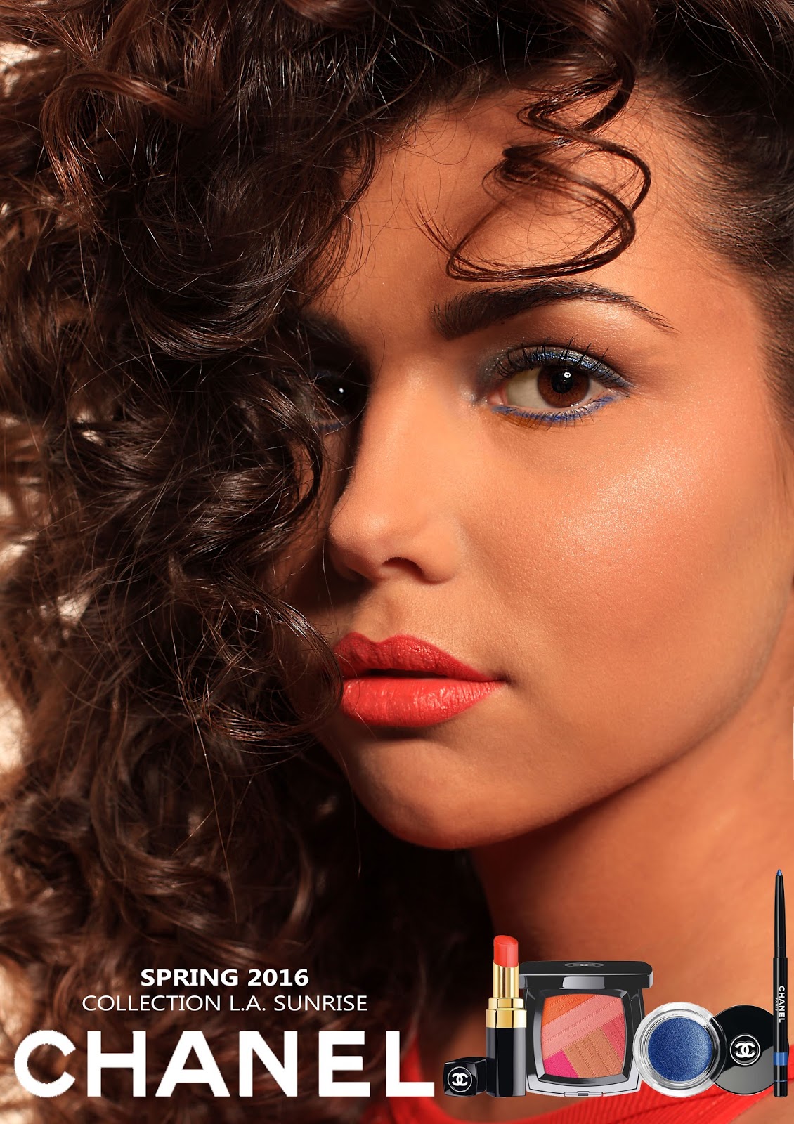
EDIT FOUR

I finally achieved what I wanted when I was looking through my vogues to advertisement layouts and how I could use this single photo as a double page spread I got it. I opened up photo shop and set it as landscape A3 and I found the line down the center of the page and pasted the image onto it, moved it to the left side and made sure it went into the center so both halves are equal. On the other side I bucket painted it with white as the page was transparent and then I copied over the products and the logo etc. At the bottom of the page I realised most ads have a website link at the bottom so I included a link to the Chanel collection. I am so much happier with the outcome of this advertisement as it's what I pictured it too look like and I think having the products on a separate page looks much better as on the single page it looked a little messy. I feel this looks like it would fit into a magazine well and look like an actual advertisement, and i'm very happy with the outcome.
FEEDBACK
I showed Kat my final piece after taking on her advise with using the portrait image. I firstly showed her the singe page spread and she agreed with what I said as it looks too crowded and too much on just a portrait image. I then provided her with my second edit the double page spread with the products on one side with the white back page and the feedback was very positive and felt it was a strong image to use and frames nicely and likes how the product are on a separate page clearly and making it a double page advertisement. This is the advertisement image and layout I have decided to go with for my day look and feel the collection compliments what is on the face and is a look that can appeal to everyone for selling the collection through this ad.
No comments:
Post a Comment